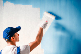
 Choosing the right paint color can feel like an overwhelming task. The right hue can instantly freshen up a room, making it more inviting and comfortable. Painters can help you pick the right one for your home.
However, many homeowners end up disappointed with their new paint job because they broke the biggest rule when selecting a paint color.
If you’re in the market for a new paint color, it’s important to understand undertones so that you don’t end up with a hue that clashes with your home’s existing finishes. Whether you’re going for a classic, neutral look or taking a design risk with something bold, knowing how to recognize the undertones of a paint color will make all the difference.
Undertones are the underlying pigments that affect how a paint color looks. They can have a huge impact, especially when paired with other colors. For example, a blue paint with green undertones might work well with white, but it might clash with pink. Identifying a paint’s undertones will help you match it with other colors easily and ensure your new color will look good in any room.
The easiest way to see a paint’s undertone is by comparing it to other colors. Start by grabbing some swatches of white paint and laying them next to each other on a blank piece of paper. That will show you the different undertones in each one – some might lean yellow or olive, while others may have a hint of purple or blue. It’s also helpful to look at the swatches with natural and artificial lighting to see how the undertones change depending on the light in your space.
You can also try laying the swatches against your furniture or other items in your room to see how they look on the walls. If you have a granite countertop or tile backsplash, it’s easy to see how the paint will coordinate with those surfaces. You can also ask the paint store to give you the paint’s formula, allowing you to see what pigments are mixed to create it.
Once you’ve identified a few potential paint colors, request samples of each to try in your home; that will give you a better idea of how it’ll look in your lighting and with your furniture and will also let you know how well it pairs with other colors in the room. Using a sample can also help you determine if the undertones of the paint are warm or cool, which will influence your design decisions.
If you want a room to feel relaxed and calm, choose warm hues that evoke comfort. In rooms that require stimulation and energization, bright, vivid colors that make you think and act quickly are ideal.
Once you have a good sense of the mood you want to create, browse for paint colors that meet your criteria. Achieving your goal can be easier than you think, especially when you know what to look for.
Rather than selecting a paint color based on those tiny chips from the home improvement center, take a sample home and test it against your furniture, curtains, and decor. The lighting in a store is different than the light in your house, so you want to be sure the shade you choose is right for your space.
Remember that mass tone is the main color your eye perceives, and undertones are the subtle hints of another color that can make or break a design. Once you learn how to recognize the undertones, narrowing down your paint options will be much easier until you find the perfect hue for your home.
Also, remember that your paint color will appear different at different times of day, depending on natural sunlight or artificial lighting. The same shade may appear yellow or green under fluorescent lighting, while it may look more blue under incandescent lights.
In addition to the types of lights in your room, consider other factors like the color and texture of your walls and ceilings. For example, if your home has a lot of wood paneling or molding, you might opt for a darker shade to make these features stand out more.
Another thing to remember is the light and sun that comes into your home throughout the day. If you have a lot of sunlight, you might opt for a lighter shade of paint to brighten your space. If you have dim lights, choose a more muted shade so the lights don’t dominate your design.
If you have furniture in your home that you want to keep or plan on re-doing your window treatments, it’s important to consider what color they will be. These colors should complement your new paint rather than clash with it. You can use a complementary color, which is the opposite on the color wheel (red and green), or an analogous hue located next to each other on the color wheel (blue and purple).
It would be best to look at your accessories, floor coverings, and any existing wall art when deciding on a color for a room. These colors will all play a role in the final product, so it’s important to consider them early on.
Lastly, it’s crucial to always sample a color before committing gallons of paint to a project. Many people skip this step, but it’s the best way to ensure you’re happy with the finished product. If you’ve ever looked at the back of a paint store, you’ll notice stacks of returned paint cans from homeowners who still need to do this step.
Once you’ve narrowed your choices, bring samples home and tape them to the wall. That is a great way to see what they will look like in your lighting, furniture, and other accents. Alternatively, some paint companies offer online tools that allow you to upload a photo of your space and try out different colors to see how they might look.
Choosing the right paint color can make your space feel fresh and new or give it a more moody and dramatic vibe. Following these tips, you can find the perfect color for your home and avoid costly mistakes!
Whether you love to stay on the pulse of home design or are hesitant to try new colors, looking at what’s currently trending in the market can help inspire you. While Pantone’s color of the year usually gets a lot of attention, it’s also important to look at other sources of inspiration. Paint companies are often the best source of color trends because they want to make their palettes appealing and attainable to consumers.
If you want to know what to look out for in 2023, consider that earthy tints are a big trend, with several of the most influential paint brands opting for shade names like “October mist” and “evergreen fog.” These warm, neutral hues embody a natural quality that can bring comfort and stability to any space. Similarly, shades of gray have become popular because they can help unify spaces with their subtle, nuanced undertones. For example, Sherwin-Williams’ Poised Taupe is a warm gray with fine yellow and blue undertones that create a soft, sophisticated feel.
In addition to warm neutrals, uplifting shades are also on the rise. Brighter yellows and tangerines can make rooms feel cozy and inviting. Meanwhile, baby pinks are seeing a more mature and sophisticated resurgence than what we typically associate with the shade.
Other shades that are a hot commodity include deep blues, which continue to rank high on the popularity chart. Blues can bring a sense of tranquility to any room, especially when combined with complementary neutrals. For instance, a navy blue and white bathroom can feel fresh and crisp with matching accessories and molding.
Purple is another vibrant shade that’s starting to gain momentum. It’s a great choice for accent walls because it can draw the eye upward and elevate any space. However, be careful when using purple in larger areas because it can overwhelm a room.
Choosing the right paint color can impact your home’s value and resale potential, so it’s important to follow these tips when selecting a color for your walls. By testing out a few different options and understanding what to look for in a good paint color, you can find the perfect hue that will serve your space well for years to come.